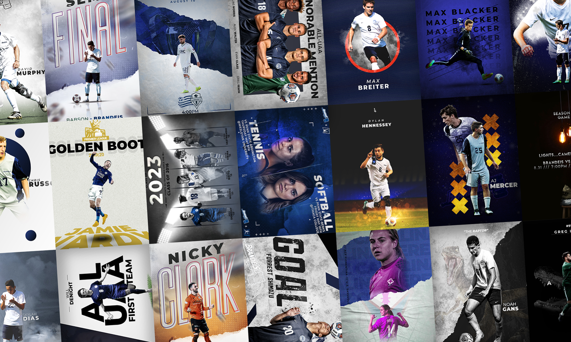
This is one of my favorite designs, as I rarely get to incorporate the red tones in my work, as I mostly deal in the cooler colors. For this I was able to sneak some in to make it seem like a light was just up above, and add some depth to the image.
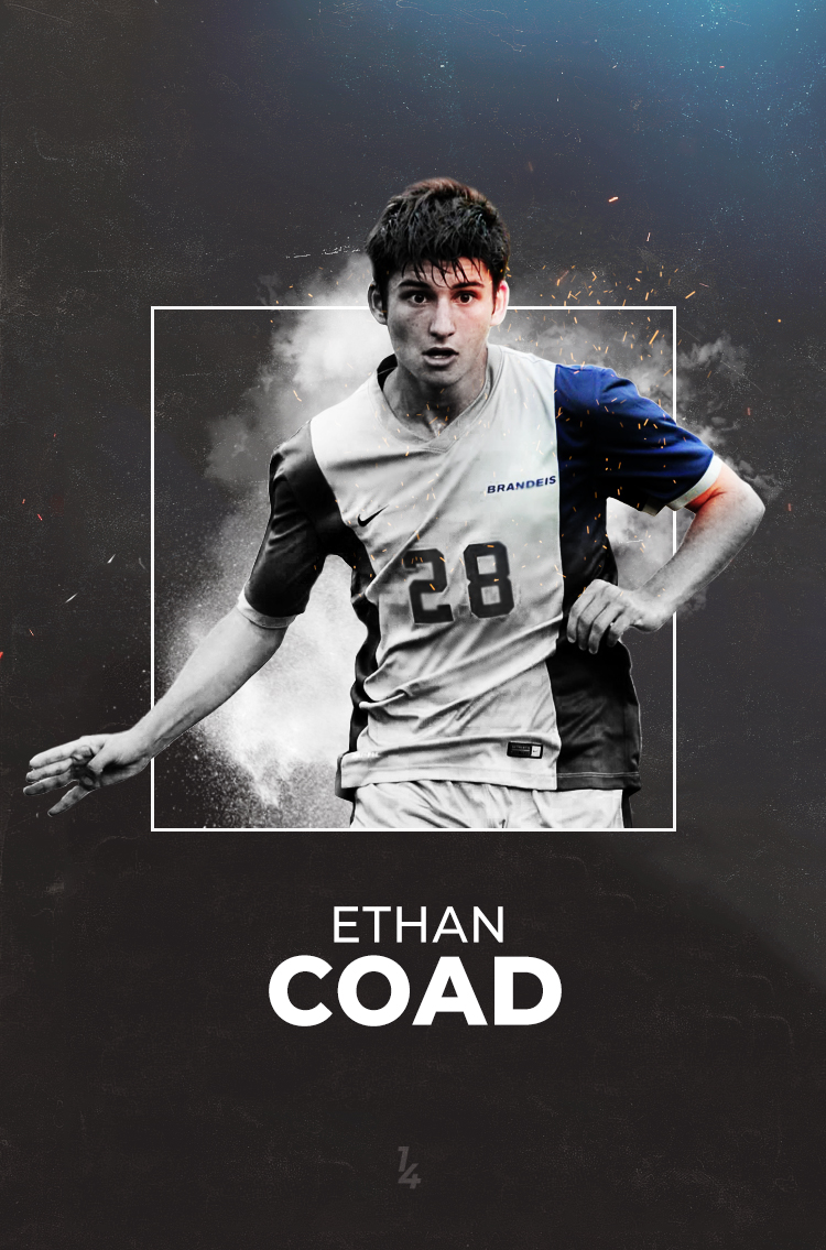
This was a bit out of my comfort zone, as I am not used to working in pure black, but I like the way it turned out. To have the alligator fade in was the most difficult part, but I managed to blend all components together.
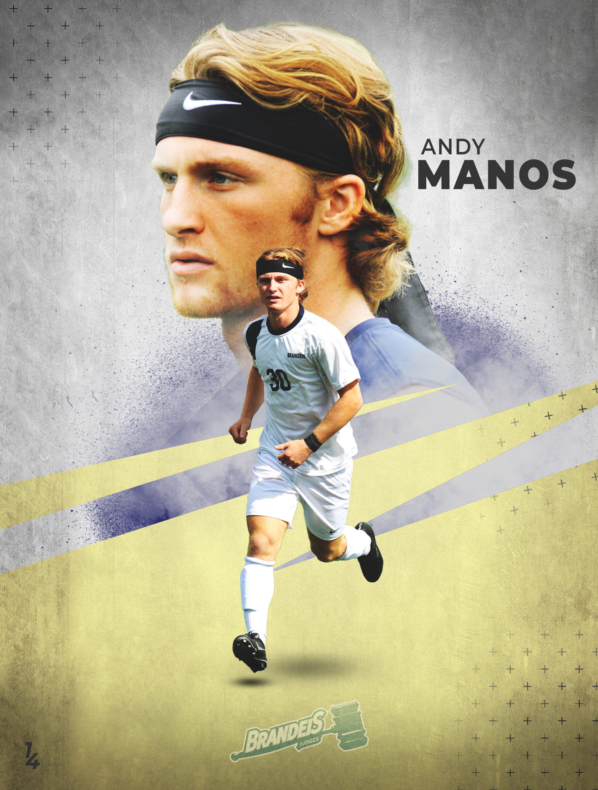
Andy is one of those people that I just love to work with. He manages to look so elegant without even trying, and the headband tops it all off. I had to do a bit of work to give him the glow he has in this design, but I am really happy with how it turned out to look.
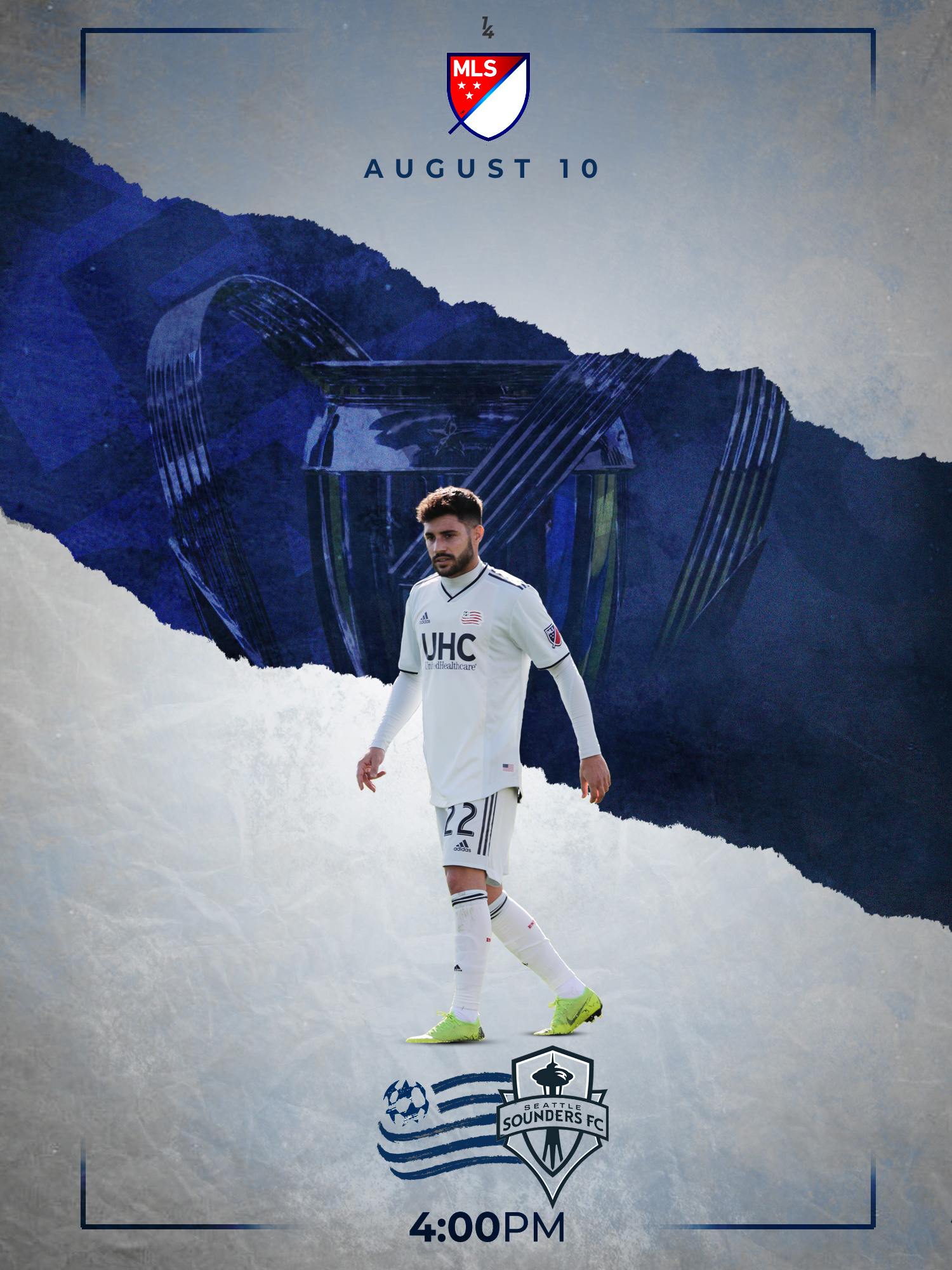
This idea took a bit longer to come to fruition, as it was difficult to get the trophy to look natural in the background. I love how the team crests look at the bottom as well; I will try and incorporate that look a bit more in the future.
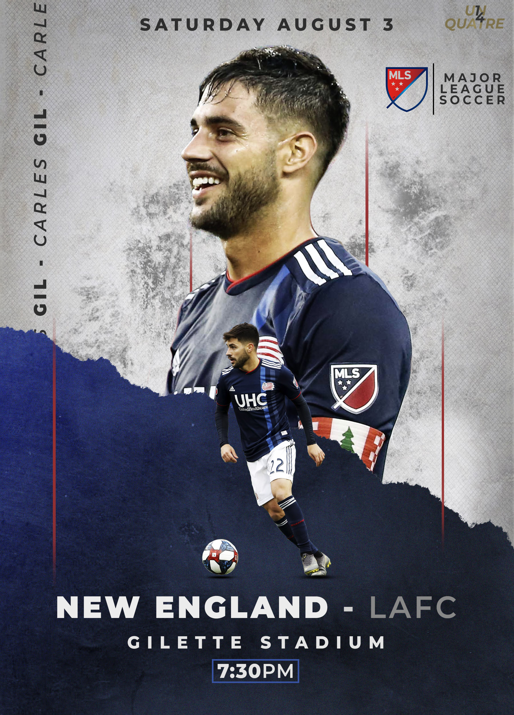
There is a bit more going here in this design than I am used to, but it all meshes well together in the end. I love how the blue texture looks, and the red stripes actually blend in well with the whole poster.